A new privacy law gave 30M+ banking customers the right to control their data, and gave the bank months to make that real. This is the story of one platform built for two people who could not be more different: the customer deciding, and the operator who has to prove it happened.
ClientHDFC Bank
RoleProduct Designer · both surfaces
TimelineSeveral months · iterative
PlatformWeb + Mobile
RegulationIndia DPDP Act 2023
The stakes
A new law. 30 million customers. A deadline that didn't move.
India's Digital Personal Data Protection Act rewrote how organizations collect and use personal data. For HDFC Bank, with 30M+ customers across loans, credit cards, forex, savings, and wealth, compliance was not a feature to schedule. It was an obligation with a date attached.
The brief had two halves that pulled in opposite directions. Customers needed to see what data the bank holds, control what they had agreed to, and withdraw consent at any time. The bank needed to configure every consent purpose, version the legal text behind it, and keep an auditable record of all of it.
Two users who could not be more different. One platform. Both sides had to work on the first try.
The shape of the problem
The same record, seen from opposite directions.
A customer sees an outcome: a clear choice about how their bank can reach them. An operator sees the source: the purpose, the legal statement behind it, and the trail it leaves. Both are looking at the same consent record from opposite ends. Designing one side well was impossible without understanding the other.
The spine of the whole project. Every screen on either side resolves back to this one record.Understanding the system
Before a single screen, the data model.
Consent at a bank is not a checkbox. It is a chain, and I had to understand the whole thing before either side could be coherent.
Purpose
Why the bank wants to contact you, mapped to a product.
→
Statement
The legal text for that purpose, versioned and published.
→
Preference
What the customer actually chose for each purpose.
→
Data Subject
The customer record every interaction is logged against.
→
Receipt
Immutable proof: who, what, when, and where.
From why-the-bank-wants-contact to the receipt that proves consent. The chain the entire product hangs on.
Understanding this chain end to end is what let me design both surfaces without leaking the complexity of the middle. The customer sees the outcome. The operator configures the source. Neither should have to think about the four steps in between.
Side one · the customer
For the customer, the enemy was density.
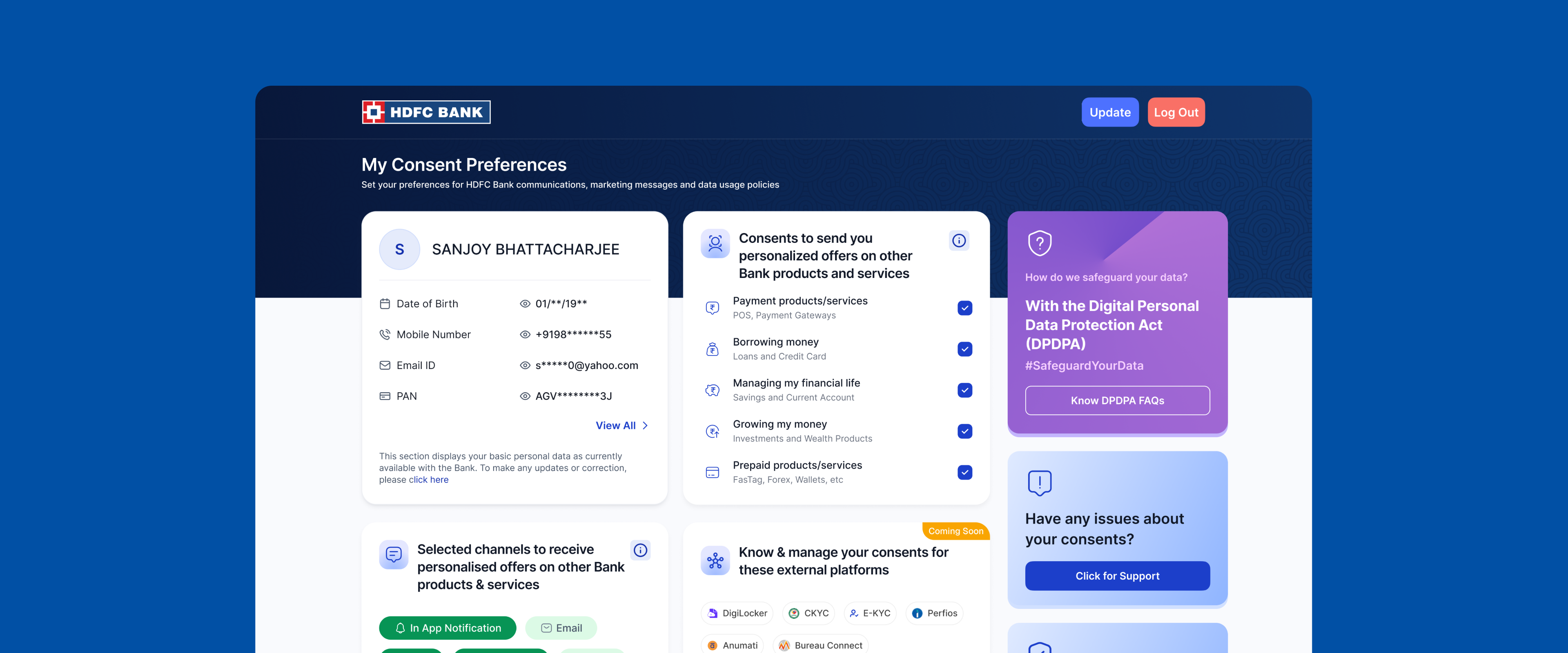
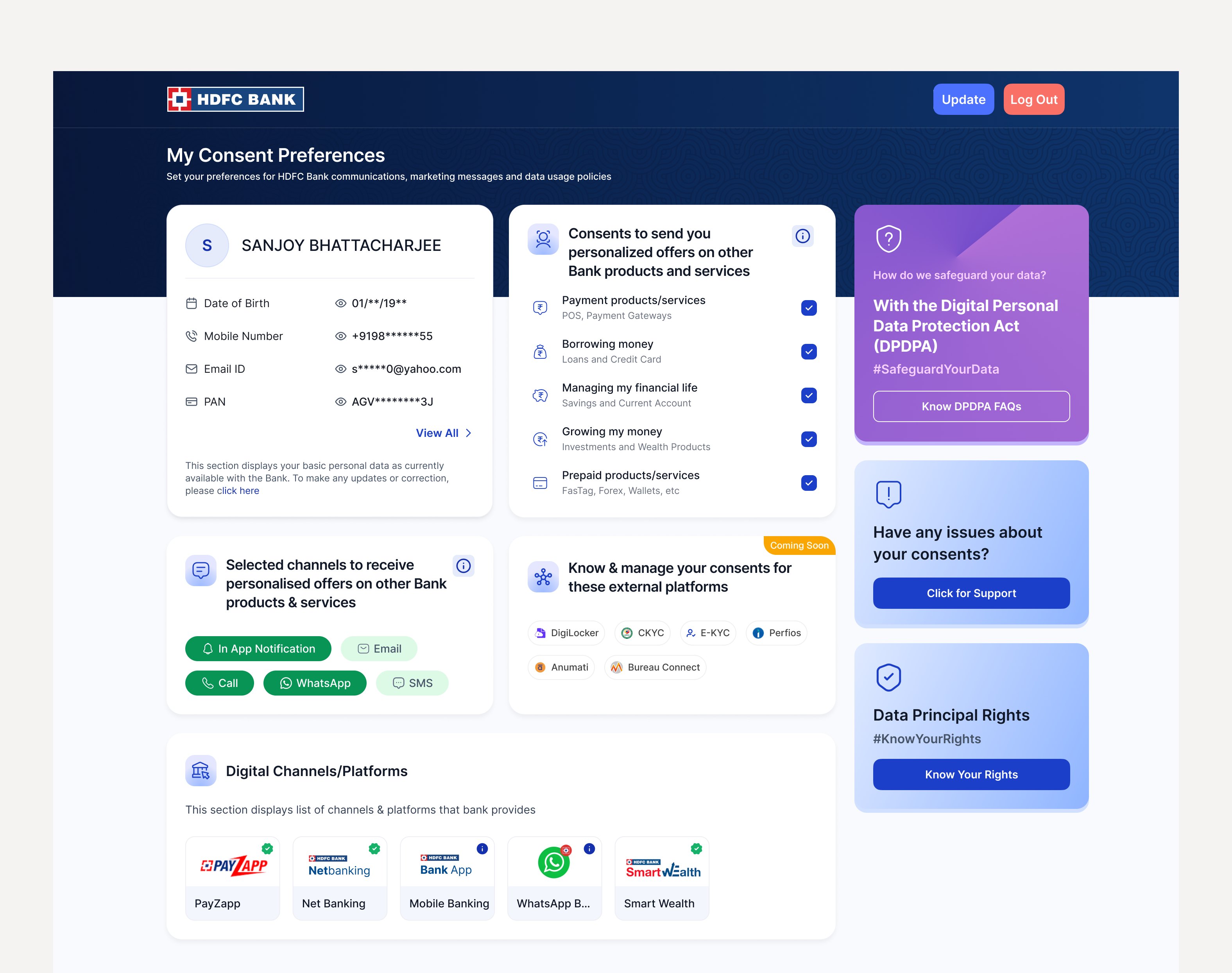
One screen has to carry a lot: the personal data on record, five categories of consent across different products, channel preferences (In-App, Email, Call, WhatsApp, SMS), consent given to external platforms (DigiLocker, CKYC, E-KYC, Perfios, Anumati, Bureau Connect), the digital channels the data flows through, and the customer's rights under the new law.
All of it is legally required to be present. Shown flat, at equal weight, it stops being a choice and becomes a wall.
The goal was never to hide complexity. It was to sequence it, so a customer starts with the decision that matters and finds the rest when they want it.
So the page is ordered the way a customer actually thinks about the bank: personal data first (who you are to us), then consent categories (what you've agreed to), then channels (how to reach you), then external access (who else can see your data). Each block stands on its own and can be acted on without touching the others.
The full customer view, sequenced by what matters most rather than by what the law lists first.
Making legal language feel human
The consent text itself is legal ("I permit HDFC Bank to process my data..."). It has to be exact, and exact is rarely readable. So the plain-language category names carry the meaning up front, and the legal statement sits one layer behind: present, accessible, never the first thing you read.
A customer who understands "Borrowing money: Loans and Credit Card" makes a better choice than one handed the verbatim clause. The cost was a review loop, every label checked against the legal text for accuracy, which protected both the customer and the bank.
Rights that don't interrupt the task
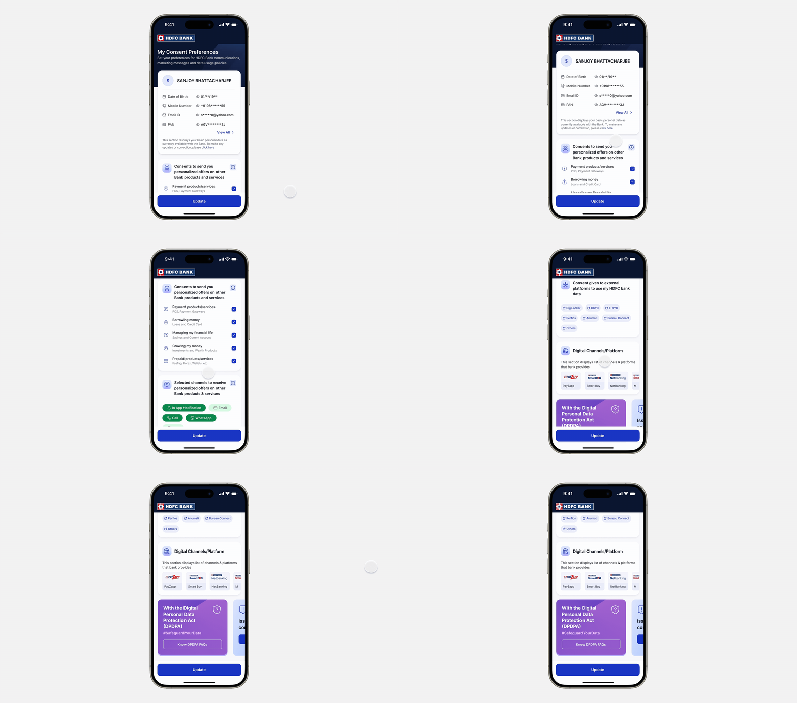
Customers also need to understand their rights under the new law. But a primer dropped into the middle of a task is where completion goes to die. DPDPA context (how data is safeguarded, Data Principal Rights, FAQs) lives in a persistent side panel on desktop, and below the task on mobile. There when you reach for it, never in the way.
The same information architecture on mobile: the Update action anchored at the bottom, DPDPA context collapsed below the primary tasks.
Side two · the operator
For the operator, the enemy was the spreadsheet.
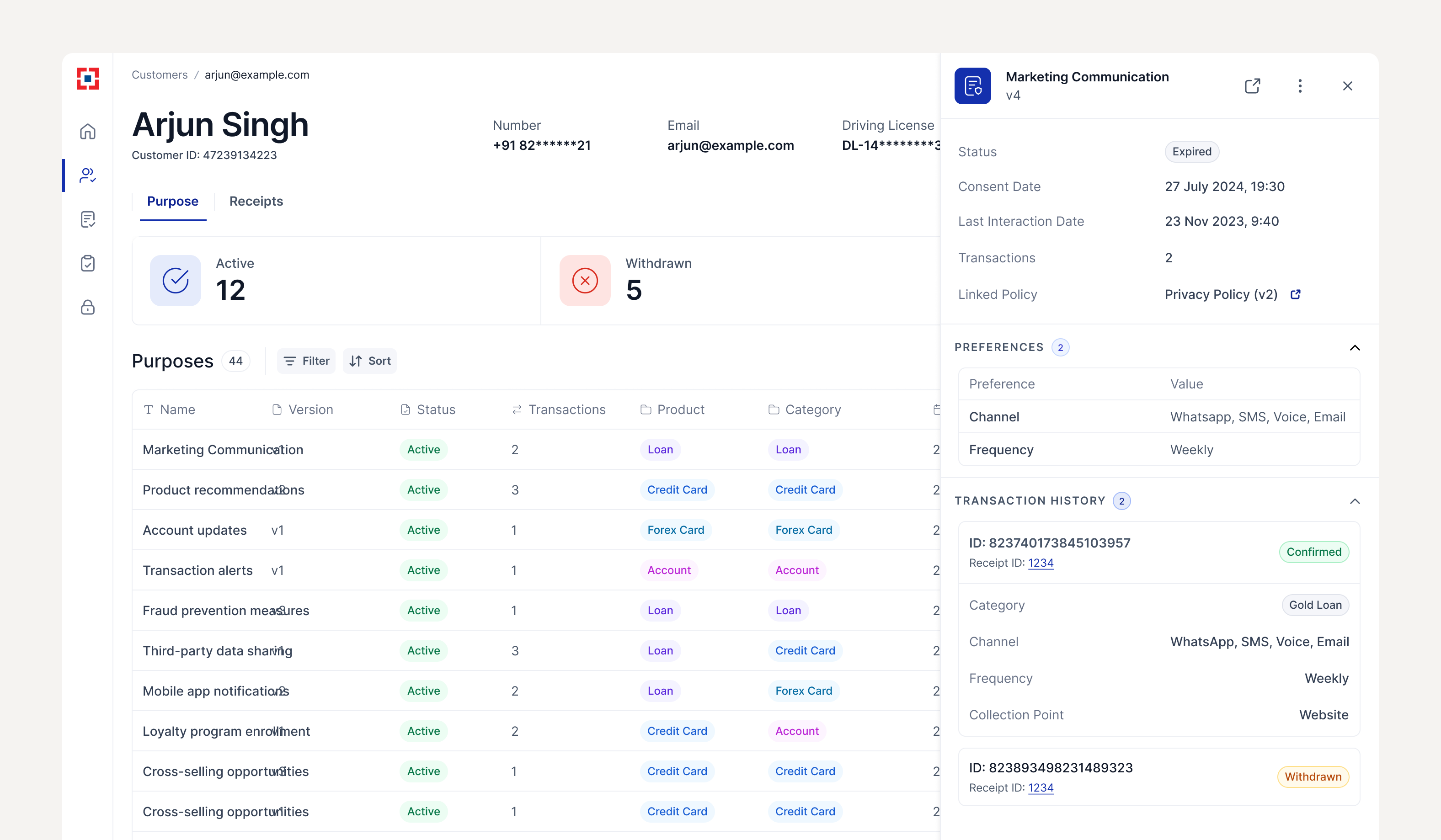
The Purpose, Data Subject, and Receipts tables carry dozens of columns: product, category, status, version, collection point, application, timestamps. The easy build is a spreadsheet. The right build is something an operations team can read at a glance, every day, without drowning.
Operations teams scan for anomalies; they do not read rows top to bottom. So color-coded category tags (Loan, Credit Card, Forex Card, Account) became the primary visual anchor, with status and version surfaced, and columns ordered by what an operator acts on first. They can spot what needs attention without opening every row.
Color carrying meaning only works if it means the same thing everywhere. That became a system constraint, held consistent across every admin surface so a tag never had to be relearned.
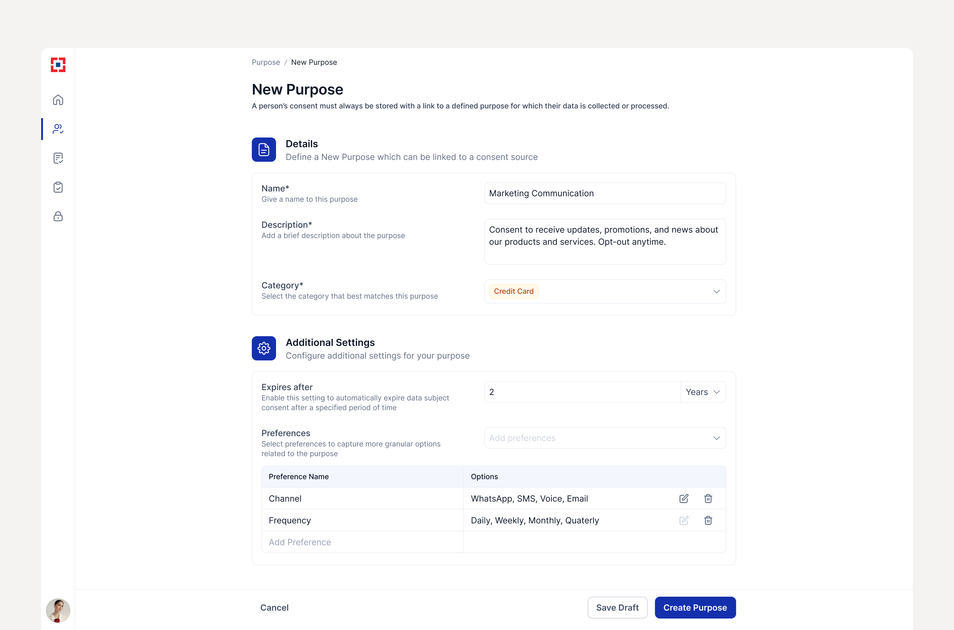
Where bank teams configure consent purposes: product, category, status, version, and collection points surfaced for scanning.Every customer's consent history, logged with receipt ID, application, and timestamp.
The layer that connects legal text to a checkbox
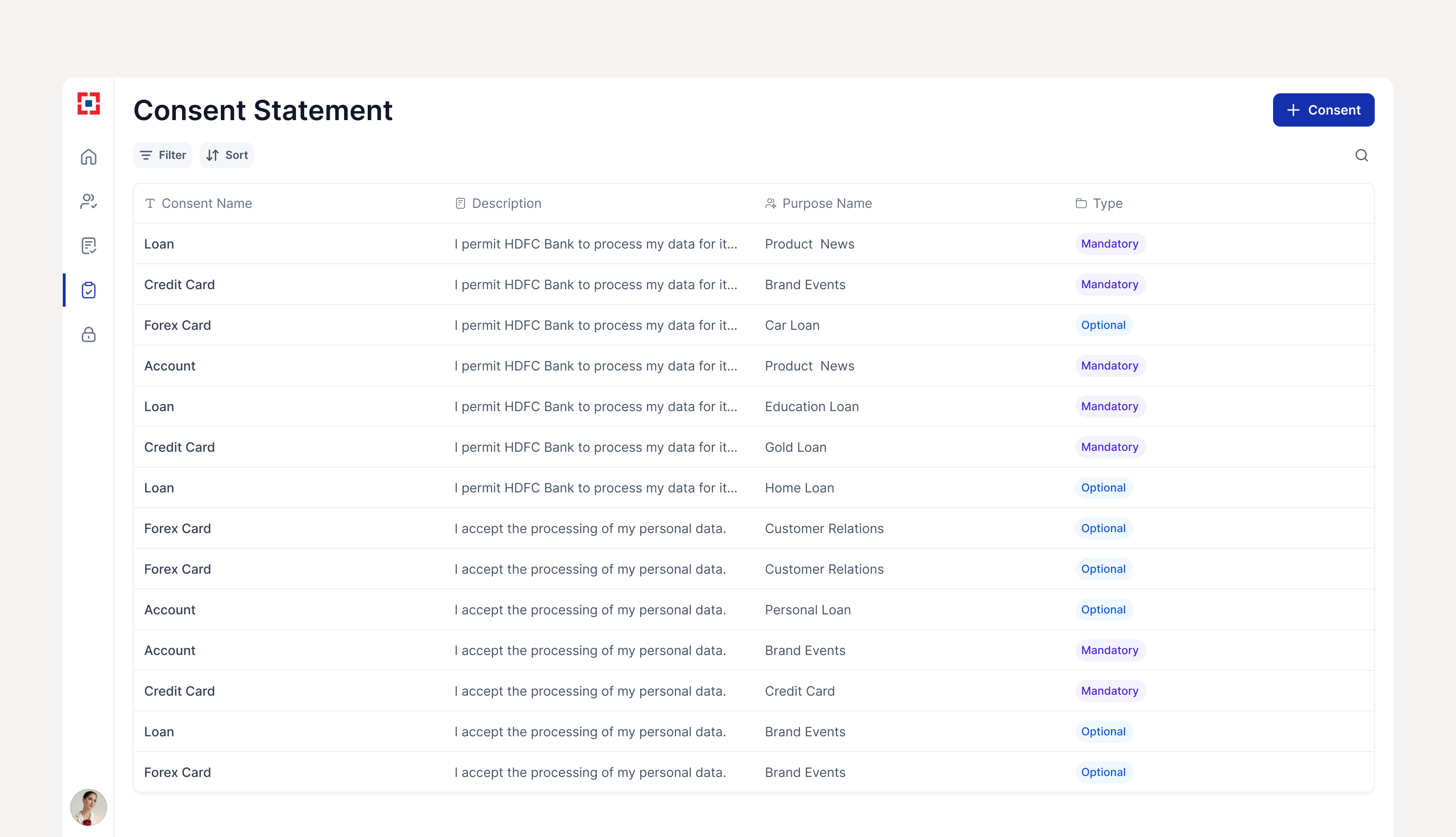
Consent statements are managed by type, mandatory or optional, and mapped to purposes. This is the seam where the operator's legal text becomes the customer's plain-language choice, and it had to stay legible to the people maintaining it.
Legal statements managed by type and mapped to purposes, connecting the legal layer to the customer-facing checkbox.The proof layer
Compliance is only real if it's auditable.
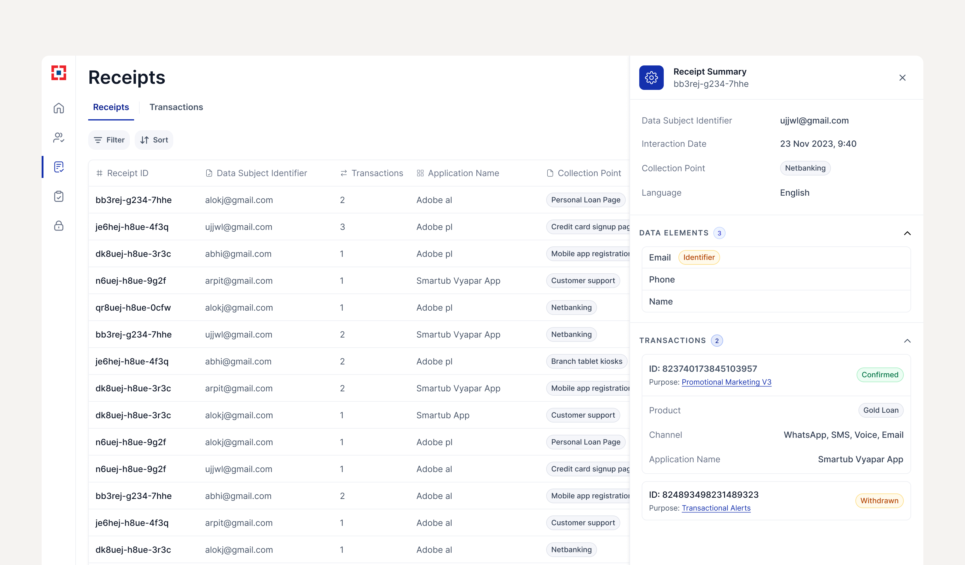
Underneath both sides sits the receipt: an immutable record of every consent transaction, who agreed, to what, when, and where. It is the layer that turns 400M+ records from a number into something a regulator can actually check.
Immutable consent receipts. Every transaction carries a receipt ID, collection point, and timestamp, which is what made DPDP Act compliance provable.Impact
400 million consent records, and a bank that now moves 98% faster on new initiatives.
These are UnifyApps' reported figures from the HDFC deployment. I did not measure them, but I designed the surfaces that made them possible.
400M+ consents captured
For 30M+ customers across loans, credit cards, forex, accounts, and wealth products.
$4M yearly cost savings
By replacing manual and fragmented consent processes with a unified, automated platform.
98% faster time-to-market
For new initiatives requiring consent, because the infrastructure was now in place.
40% delivery optimization
Through precise channel preference management across 3M+ daily communications.
10+ AI apps deployed
Across HDFC's Data Privacy Office, Finance, and Legal for 30M+ customers.
Reflection
Legal requirements and good UX are not opposites.
Compliance design is still user experience design. The law required certain information to be present. It never said how to organize it. The work was finding an order that served the law and the customer at once.
Density is a design problem, not a content problem. The tempting question is "can we remove some of this?" The better one is "what order does this need to be in?" Sequence solved what reduction couldn't.
Institutional feedback is part of the constraint. Months of iteration through a bank's review process taught me to make decisions explicit and rationale visible, so feedback could be specific rather than directional.
Designing both sides changes how you see each one. Understanding how an operator configures a Purpose made me sharper about how a customer should see it. They are the same data, seen from opposite directions.