Designing data trust for people who don't write code.
A data quality and cataloging system inside the UnifyApps data suite, designed for the analysts, stewards, and compliance teams who own data but were never given tools they could actually read. Built to sell into tier-one banks and financial institutions with data estates too large to check by hand.
PlatformUnifyApps Data Suite
RoleProduct Designer
TeamTwo designers · PM-led
SurfacesData Quality · Data Catalog
DomainGovernance · MDM · ETL
The problem
Enterprises are accountable for data they cannot see clearly.
The people who carry that accountability, the analysts, stewards, and compliance teams, rarely write code. Yet the tools built to help them were built for engineers. The gap between who owns data quality and who can operate the tooling is the whole problem.
We designed two products inside the UnifyApps data suite to close it. A Data Catalog that answers what data exists and where it lives, and a Data Quality product that answers how good that data is, and what to do when it isn't.
This is mostly the story of the second one. Data Quality was the deep build. Data Catalog came earlier as a focused, one-week project, and it shares one idea with Quality that turns out to be the spine of everything here.
Built for
Tier-one banks and institutions with data estates too large to check by hand.
Built as
A product inside the UnifyApps platform, not a one-off for a single client.
Before any screens
The hard part wasn't visual. It was understanding.
A client asked for data governance, but UnifyApps chose to build it into the platform as something any enterprise could buy. That raised the bar: it had to generalize, not just satisfy one team.
Before we could design a single screen, we had to understand a domain neither of us knew: connectors, sources, master data management, ETL pipelines, and the ontology that ties them together. We read the documentation for Ataccama, Informatica, and Reltio closely, and worked through how data actually moves through an enterprise.
The design became that understanding, translated into something a non-engineer could hold in their head.
Research and problem framing were led by the product team. Our job was to take a domain that resisted simplification and give it a shape.
The competitive read
Powerful tools nobody could actually use.
The incumbents were not missing features. They were missing legibility. Three failures kept surfacing across all of them, and each one became something we set out to fix.
01
Rules were authored one column at a time
At enterprise scale that means thousands of columns and thousands of near-identical rules. The work was never finished, and it never could be.
02
The pieces didn't connect
Catalog, profiling, quality, and remediation lived as separate modules with separate mental models. Users hopped between disconnected tools and rebuilt their context every time.
03
Power was visible, but not usable
Capability was exposed through dense, engineer-first interfaces. Where these tools added intelligence, it arrived as a black box that quietly made decisions for you.
The reframe
We reduced the whole product to three layers.
Legacy tools expose hundreds of capabilities flat, with no narrative to hold them. We needed a structure simple enough that a steward could carry it in their head and have the rest of the product make sense. So we cut it to a sequence: define the language, attach the rules, run the loop.
Layer 01
Vocabulary
Business Terms describe what your data means. You define this language once.
EmailCustomer IDSalary
Layer 02
Rules
Detection rules decide which columns earn which Terms. Quality rules decide whether the data is good.
DetectionDQ evaluation
Layer 03
Execution
Monitoring projects run the rules against live sources, surface results, and route problems to the people who fix them.
The mental model. The structure we drew in week one was still the backbone at handoff.
Once a user understood "define the language, attach the rules, run the loop," the surface stopped feeling like a control panel and started feeling like a workflow. The next three sections walk down those layers, and the hardest design problem lives inside each one.
01Vocabulary
Govern the language, not the columns.
Quality rules applied per column do not scale. Define "valid email format" once and you would still have to re-apply it to every email column, in every source, forever. That is the trap every legacy tool fell into.
So we made Terms the unit of governance. You attach a quality rule to the Term "Email," not to a column. Detection rules map that Term onto every column that qualifies, and the rule cascades to all of them automatically. Define once, govern everywhere.
Define once, govern everywhere. A single Term carries its rule to every column detection maps it onto.
This matches how stewards already think. They reason about kinds of data, all our email fields, not individual columns. The product now reasons the same way they do.
The honest tradeoff: value is back-loaded. You build a glossary before you see results, which makes the first session heavier.
We softened that with profiling and AI suggestions that build part of the glossary for you, but the cost is real, and it is the thing we would tackle first if we did it again.
02Rules
Make the logic readable. Keep the human deciding.
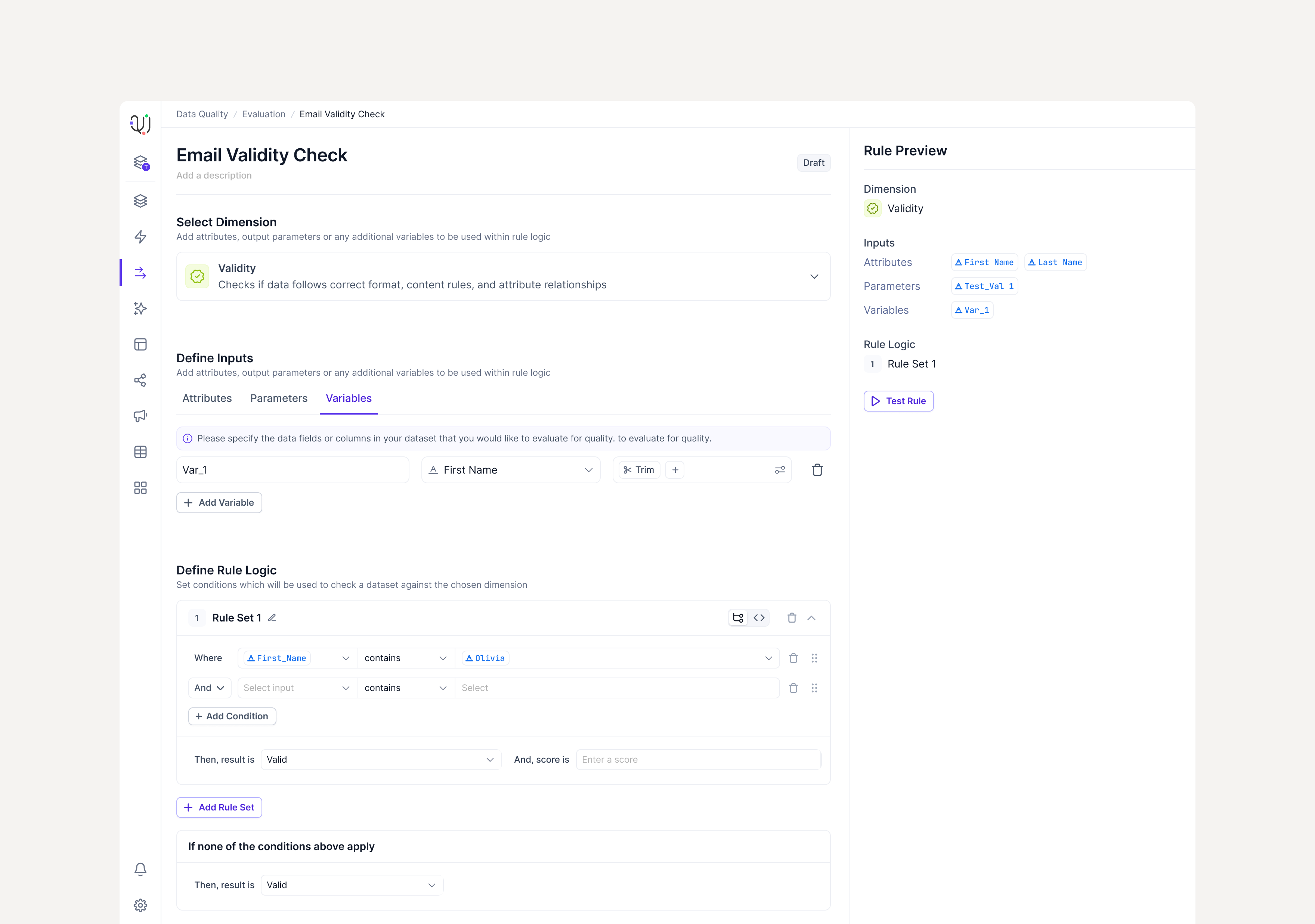
Rule logic is genuinely technical: input attributes, datatypes, modifiers, conditions, scores. A business steward cannot read a raw expression. A power user needs real expressiveness. Designing for one group usually breaks the other.
We built a rule builder that reads as a sentence. The condition sits on the left, the result and its quality dimension on the right, and every rule is testable against live sample data before it is saved.
The real rule builder, with the live sample preview that shows the consequence before a rule is saved.
A power user can still reach the rule library and custom logic when the readable form runs out. We accepted that the readable abstraction cannot express every exotic condition, and kept an escape hatch for the few cases that need it, rather than punishing the majority with complexity they will never touch.
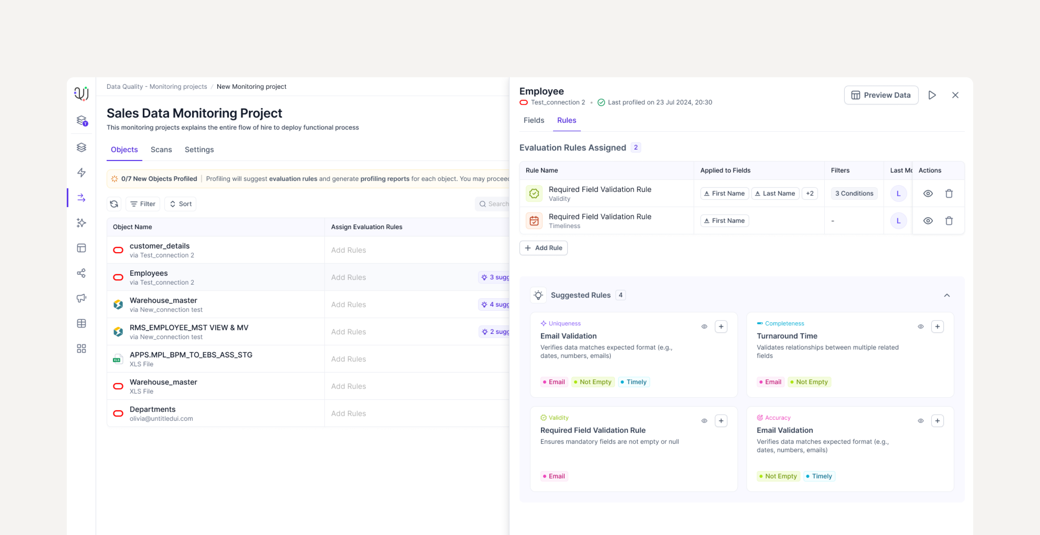
AI proposes. The human decides.
This was a legacy category, and we wanted intelligence to earn its place. But in governance and compliance work, an AI that silently changes rules or auto-classifies data destroys the one thing the product sells. So we drew a hard line: AI never acts on its own.
Profiling a source surfaces AI insights and suggested rules, which you review and approve before any of them become real. Term suggestions propose a classification you confirm. Anomaly detection flags unusual data, but it does not quarantine it. Intelligence accelerates the setup and watches for the unexpected. The human stays the authority on every governing decision.
Profiling surfaces AI suggestions; the approve step is where a suggestion becomes a rule.
In a domain where someone answers to a regulator, "the AI did it" is not an acceptable answer. The review step is slower than full automation. Here, that friction is the feature.
03Execution
One loop, not four modules.
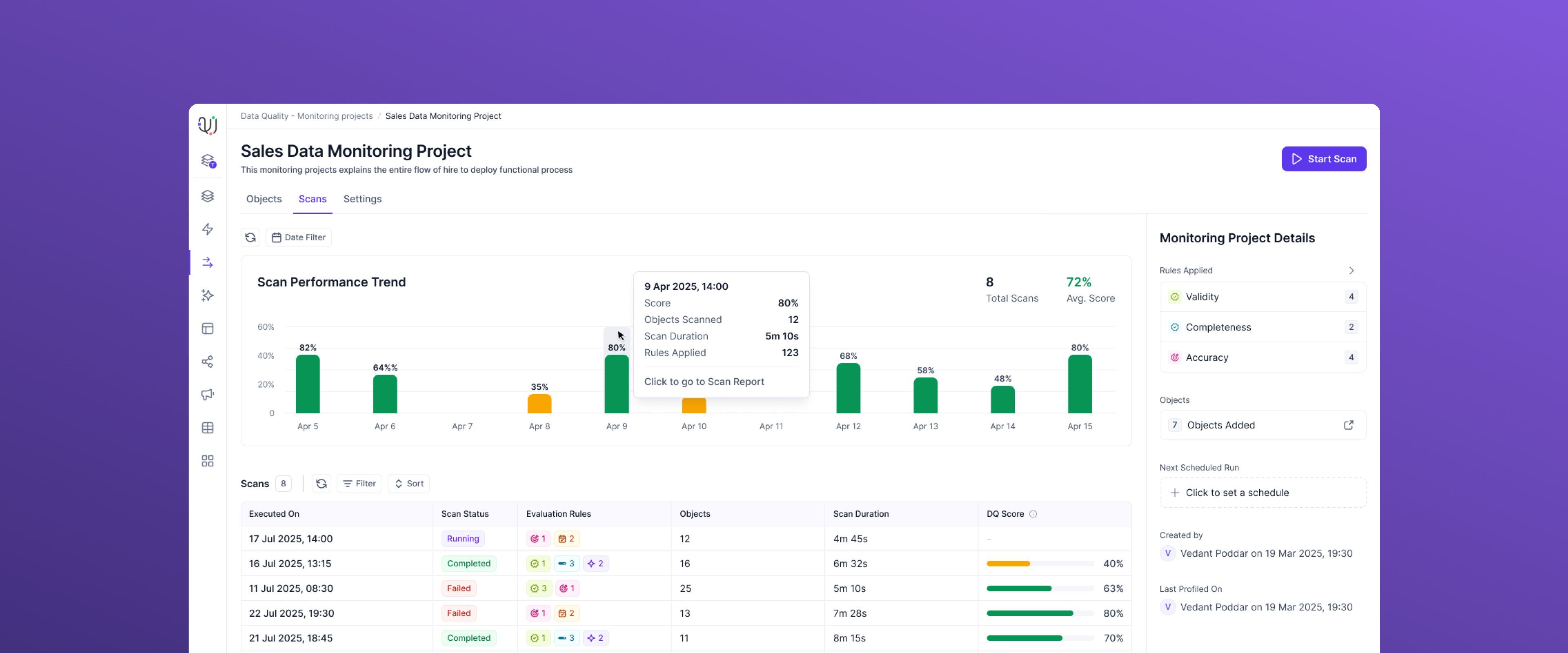
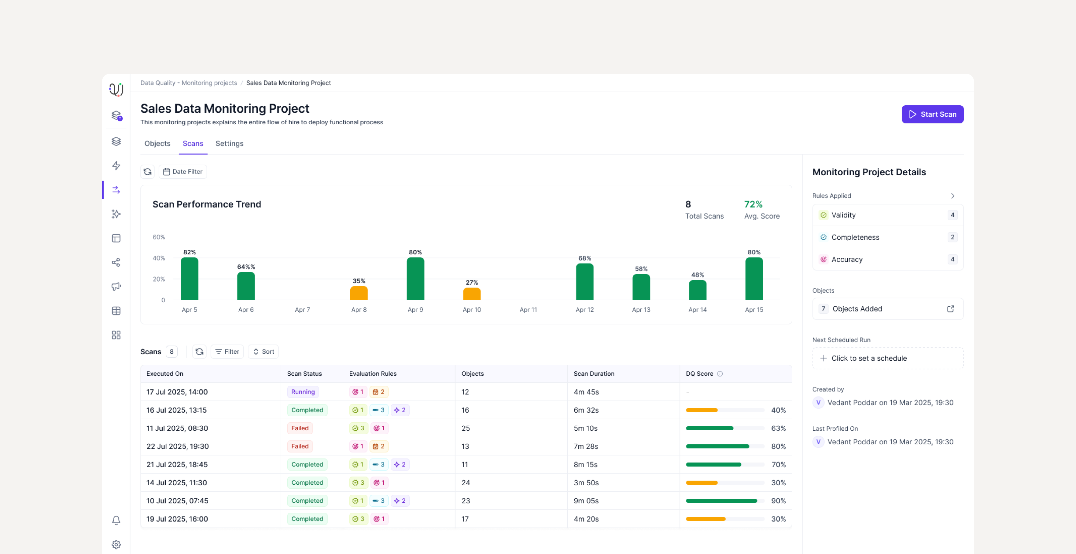
In legacy tools, defining rules, running evaluation, reading results, and fixing data were four disconnected places. We collapsed them into a single container: the monitoring project.
It holds the whole lifecycle. Connect a source, attach rules, profile it, run a scan, read the dashboard, and route failures onward through threshold alerts and auto-created tickets, with re-evaluation after a fix closes the loop.
The lifecycle as one object. The job isn't "run a scan," it's owning a dataset's quality over time.The dashboard a steward returns to: overall score, rule breakdown, dimension results, and trends over time.
It maps to the actual job, which is not running a scan once but owning a dataset's quality over time. One object the user returns to, instead of four tools they have to reassemble in their head on every visit.
Getting started shouldn't require a manual.
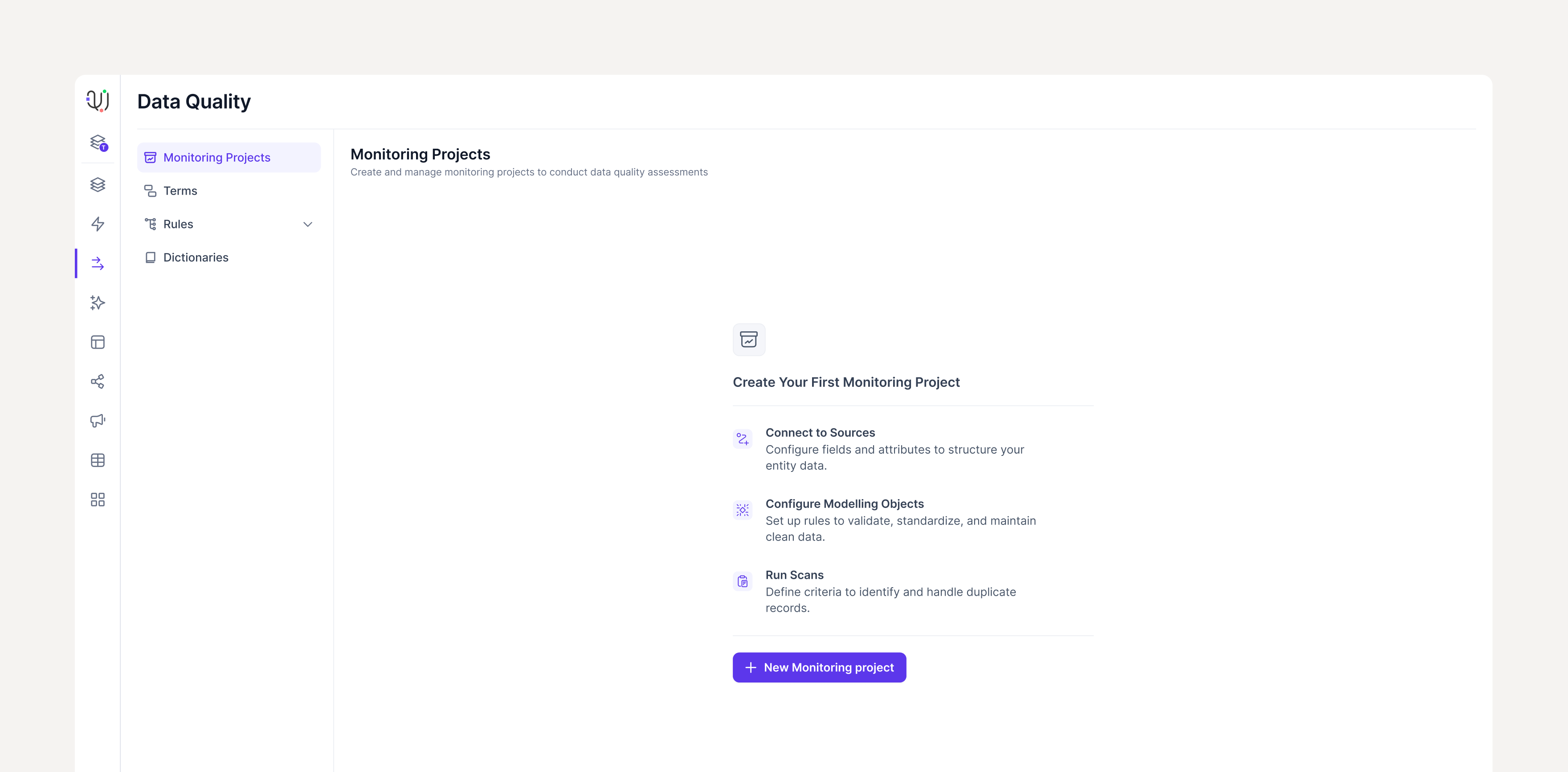
New users land on an empty monitoring project with no data yet. Most products leave that moment blank. We designed it to show exactly what happens next: three steps, three icons, one clear action to begin. The empty state is the onboarding.
Empty state as orientation. Connect to Sources, Configure Modelling Objects, Run Scans. The user knows what to do before they click anything.The companion · one week
Data Catalog: knowing what you have.
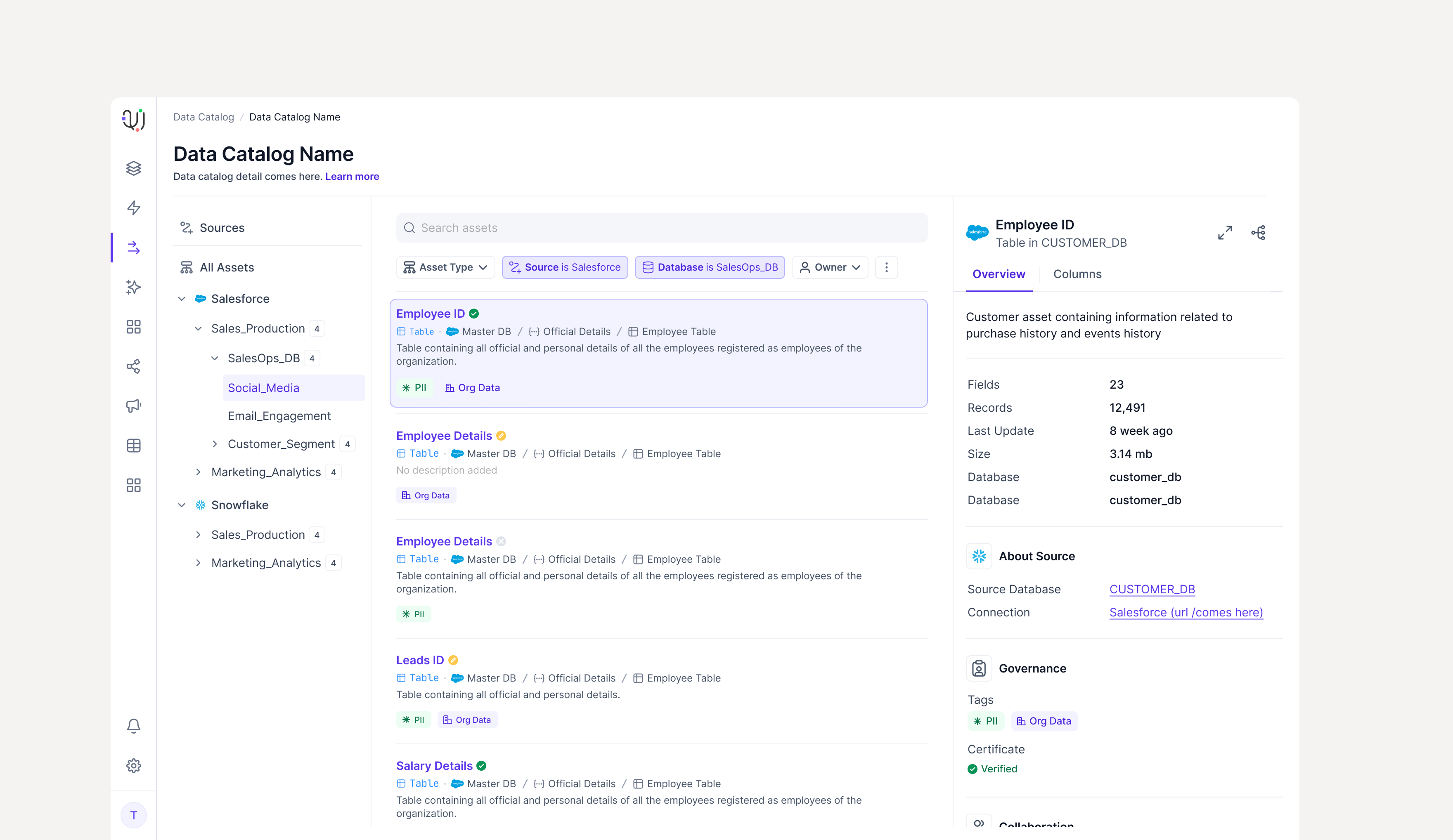
Catalog was a focused, one-week build, so we treated it as the supporting story it is. It answers the question Data Quality assumes you have already solved: what data do we even have, and where does it live?
A form that builds itself
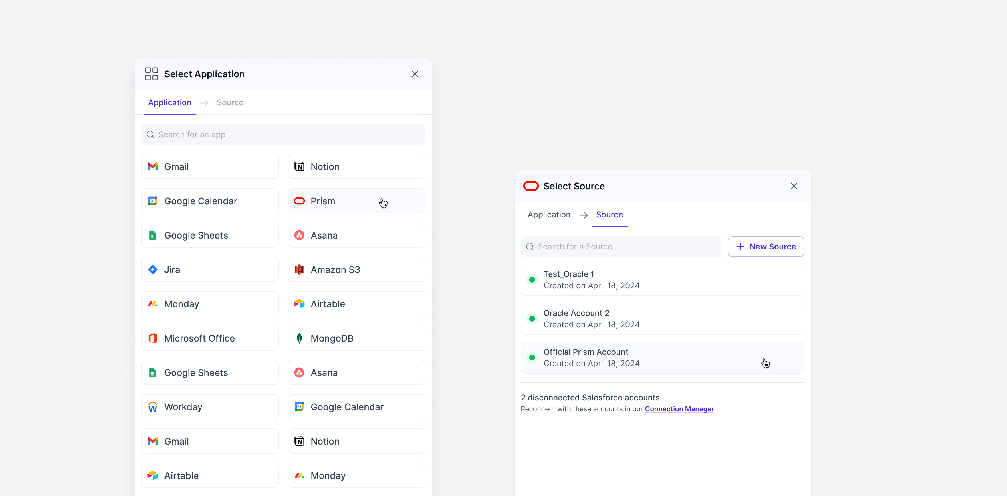
Every connector configures differently. Salesforce, Snowflake, and Kafka each need different inputs. Kafka needs schema setup; tables and views need an exclude pattern; some metadata should be skippable. A static form is wrong for all of them, and a hand-built form per connector is unmaintainable.
So we designed one creation flow with a form that generates itself from the chosen connection. You always see exactly the fields that connector needs, and nothing else.
The connection form adapts to the connector, so the user never wades through fields that don't apply.
Lineage you can read at a glance
The standout surface is lineage: a visual graph of data flowing from upstream sources, through a base object, out to the downstream views that depend on it. It turns an abstract dependency into something you can read in a second.
Lineage. Two upstream masters resolve into a golden record that feeds three downstream views.Smart filtering across the asset browser, so finding the right asset in a large estate is a few chips rather than an endless scroll.The systems thread
Two surfaces, one language.
Catalog and Quality were separate products on separate surfaces. But they speak the same language, and that is what makes them feel like one platform rather than two tools sold together.
Terms are the bridge. The same vocabulary tagged in the catalog is what quality rules attach to.
Terms defined and tagged in the catalog are the exact Terms that quality rules attach to. Catalog tells you what exists and where. Quality tells you how good it is. The shared vocabulary is the seam that disappears.
Reflection
What the work became.
We took a domain built for engineers and gave it a shape that an analyst, a steward, or a compliance lead could actually navigate. The product was positioned for the institutions that need it most: large banks with data estates far too big to check by hand.
A model is worth more than a screen. We walked into a domain neither of us understood, built a model simple enough to design around, and it held. The three layers we drew in week one were still the backbone at handoff.
Govern the kind, not the instance. Making Terms the unit of governance is the decision the whole product scales on, and the one most worth defending.
For governance, friction can be the feature. Keeping a human in the approval path is slower than automation, and it is exactly what makes the intelligence safe to switch on.
What we'd change. The back-loaded setup cost is real. A new user should reach their first result before they have finished building their glossary.
No fabricated metrics appear in this case study. Outcomes are described at the product level.